A Comparison of Blues
You know how much Miss Mustard Seed loves the color blue! It’s all over her home, her studio and even her clothing! When she created our paint line, she made sure to include lots of beautiful blue options for you.
Let’s dive into our different shades of blues so you can appreciate the nuances of each one and pick the right option for your next project!
The True Blues
Our blues fall into 3 categories:
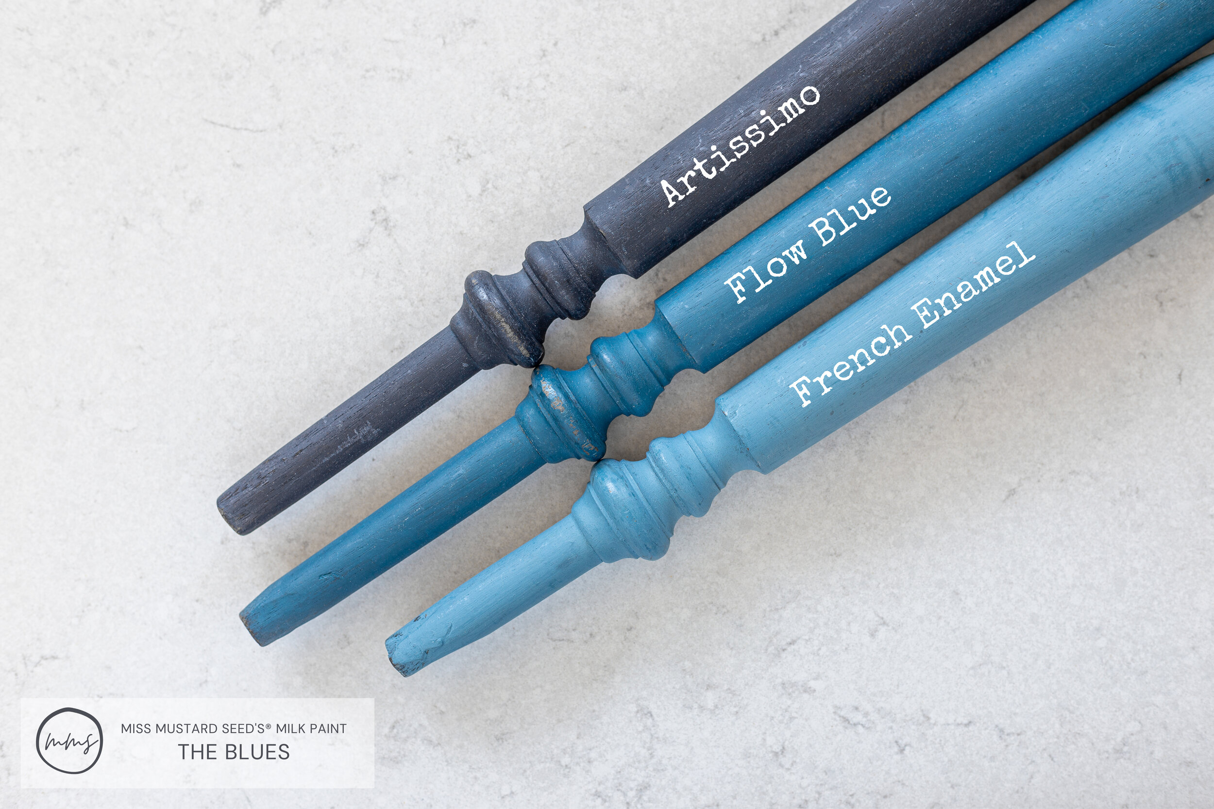
Let’s kick things off with our true blues - French Enamel, Flow Blue and Artissimo.
French Enamel
French Enamel was inspired by and named after the blue enamelware that Miss Mustard Seed admires so much!
Blue enamelware was used in European and American households in the late 1800s - early 1900s. These pieces are charming reminders of a time when even humble household items were beautifully made.
French Enamel is a medium toned blue that mimics the sky on a warm summer day
French Enamel is lighter than Flow Blue and Artissimo.
Flow Blue
Flow Blue gets its name and color inspiration from flow blue china. If you’ve never seen it before, it’s absolutely gorgeous!
Flow blue is a type of pottery that was popular in the 1800’s. The blue transfer patterns were deliberately blurred by using ammonia or lime in the kiln as they were glazed. This caused the design to flow out a little bit, hence the name - flow blue!
Flow Blue is more saturated than French Enamel. It’s darker and more intense, but not as dark as Artissimo.
Top - Artissimo | Middle - Flow Blue | Bottom - French Enamel (Samples are finished with Furniture Wax)
Artissimo
Artissimo is our saturated navy. Depending on the topcoat you apply, it can look like a pair of dark wash denim jeans or as deep as the midnight sky.
The name and color inspiration came from this P. Kaufmann fabric Miss Mustard Seed used in her home when she lived in Pennsylvania. The name of the pattern is “Artissimo”!
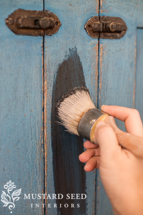
If you want to create a stunning two-toned look, layer Artissimo under or over Flow Blue, then top with Hemp Oil and/or Antiquing Wax. The effect is gorgeous!
Using a Wax Puck to create a resist between Artissimo and Flow Blue
Applying Antiquing Wax to jelly cupboard
Jelly cupboard painted in Flow Blue layered over Artissimo and sealed with Antiquing Wax
The Blue/Greens
Some of our beautiful blues lean towards the green side. If you’re a lover of this blend, then enjoy Mora, By The Sea, Eulalie’s Sky and Kitchen Scale!
Mora
Mora is a very pale blue/green that is part of our European Collection.
Mora, is actually a town in Sweden which is famous for making tall curvy style clocks. They’re appropriately called “Mora Clocks”.
Mora is paler and less green than the next darkest color, By The Sea.
By The Sea
At the time of this blog post, By The Sea is a new color we have not debuted yet. It will be part of our “Coastal Collection” nestled against other seaside colors.
By The Sea sits perfectly in between Eulalie’s Sky and Mora. It’s not as aqua as Eulalie’s Sky but it’s more saturated than Mora. It’s a wonderful choice if you want a soft oceanic shade.
Eulalie’s Sky
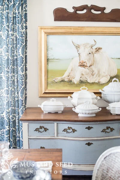
Eulalie is the name of the cow in this beautiful painting by artist, Cindy Austin.
Cindy is a long-time reader of Miss Mustard Seed’s blog, and when Marian said she wanted a cow painting, Cindy had the perfect solution!
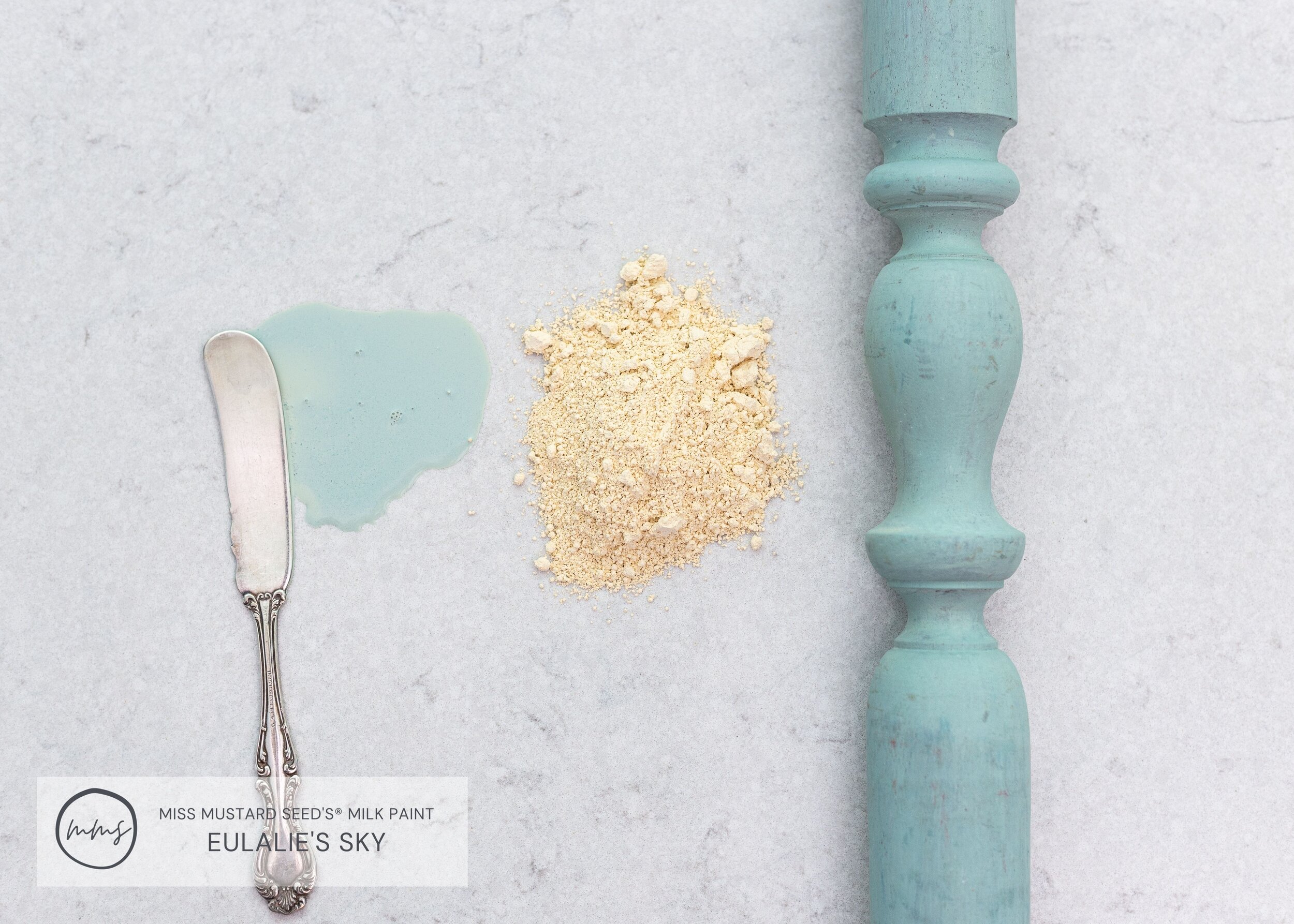
Eulalie’s Sky is a beautiful blue/green that is reminiscent of the aqua color you’d find on vintage furniture from the 1930’s and 40’s.
It’s such a fun color to paint with because the powder is actually yellow! The blues and greens don’t come to life until water is added.
Kitchen Scale
Kitchen Scale is the teal in our collection. It gets its name from the color of an actual kitchen scale that Miss Mustard Seed had in her home.
It reminds us of the deep teal waters of the Carribean. Can’t you picture yourself with an umbrella drink in your hand listening to the waves crash in the distance?
Which blue-green shade is calling your name at the moment?
The Blue/Grays
If you’re a gray lover, then we know you’re going to appreciate our three beautiful gray-blues!
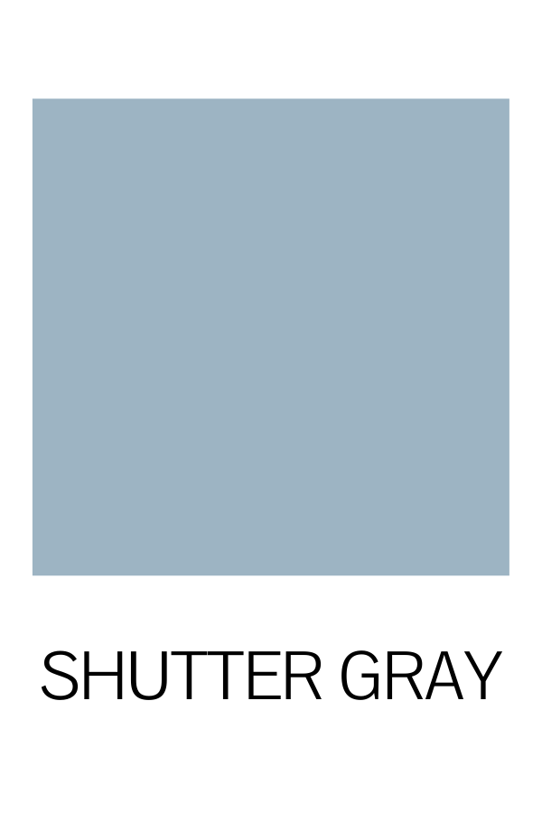
Shutter Gray
Back in 2012, this was the very first color Miss Mustard Seed introduced in her new Milk Paint line! Shutter Gray got its name and color inspiration from the assortment of faded gray shutters that Miss Mustard Seed would find during her antiquing trips in Pennsylvania. She painted this particular set in Shutter Gray. Gorgeous, eh?
Its dusty blue/gray tones make Shutter Gray a chameleon. It can lean more blue, gray or even lavender depending on what’s around it.
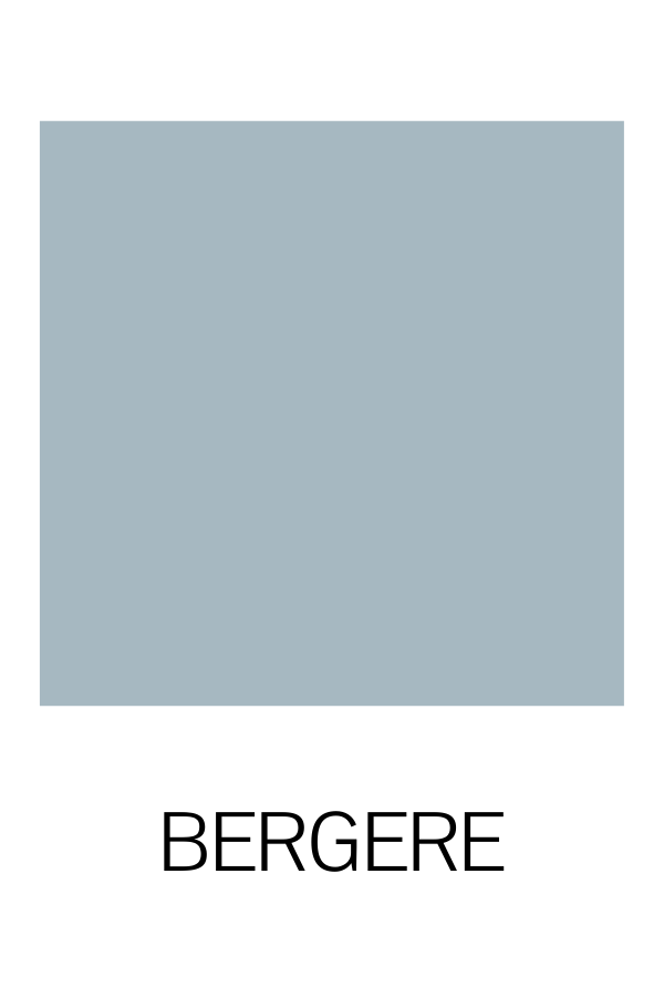
Shutter Gray and Bergere are pretty close colors. Shutter Gray leans a little more to the blue/purple side, which Bergere is more gray and smokey.
Bergere
Bergere is one of the colors in our European Collection. It’s a style of French chair that means “shepardess chair” when translated. This style made its appearance in Paris during the early 18th century.
Bergere chairs are one of Marian’s favorites, and she married the name with this perfectly muted shade of blue.
Aviary
Aviary is the darkest of all our blue-grays.
It’s smokey, moody and reminds us of the color of the sky right before a thunderstorm. Aviary got its name and color inspiration from an antique birdcage that Miss Mustard Seed found during one of her antiquing trips.
If you want to get clever, use Aviary as a background for your next chalkboard project! You can see how this one turned out by checking out our tutorial here.
Now that you’ve taken a tour of our blues, which one are you going to try on your next project?
When you’re ready to get started, our talented retailers are ready and waiting to help! You can purchase MMS Milk Paint products with them or shop online with us. We’re all ready to help you Move Mountains in Your Home®.


